By Rieva Lesonsky
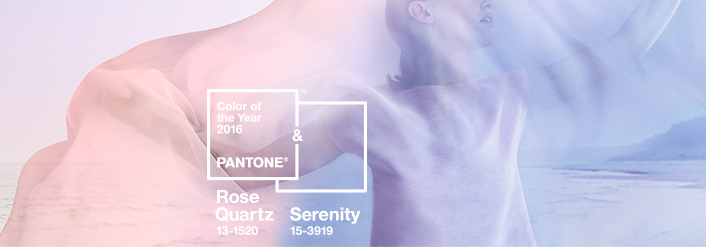
Judging by the selection of the color of the year (2016), Pantone, the global color authority, must think the world needs to take a deep breath and calm down. For the first time ever Pantone chose a “blending of two shades” as the color of the year. Rose Quartz (pink) and Serenity (blue) are supposed to “reflect connection and wellness as well as a soothing sense of order and peace.”
In its initial announcement, Pantone explained that the choice of the two colors “challenges traditional perceptions of color association.” And it added, “In many parts of the world we are experiencing a gender blur as it relates to fashion…This more unilateral approach to color is coinciding with societal movements toward gender equality and [reflects] a generation that has less concern about being typecast or judged.”
Hmmm. Sounds lofty for sure, but the two pastels look more like they’re ushering in a baby boom (which is likely going to happen). However, just as last year’s choice, Marsala (a wine color) quickly cropped up everywhere (I even own a Marsala-colored wallet), you can be sure these colors (and accompanying color palette) will be embraced by home décor and fashion designers. The January issue of InStyle magazine is already showing clothes, fashion accessories and cosmetics featuring either or both of the shades.
If you’re in retail, you’ll want to make sure you order plenty of pastel-shaded goods. And even if you’re not, maybe Pantone’s on to something and we all need to chill.


