
By Asad Ali
Color is the visual attribute anything that produces, emits or mostly, reflects light. If you are looking for the TV remote you left somewhere around the couch, you’ll have to switch on the lights because the remote will not glow for itself. Most inanimate objects cannot produce light by themselves and thus need a source to reflect their surface towards the viewer – and the viewer is always looking for something to fill the vacuum.
Psychology of Colors
Light is the basic medium through which we can see things and without it our eyes are more or less useless. Our ability to see things is one, but what leads us to seeing them are the colors. Our liking for objects are based on emotional triggers that tell us to reach out and touch them. If you really fancy orange juice then you might as well like the color orange on T-Shirts, accessories, gadgets and appliances etc. It is only fair that you wear, own or use things that are by your liking.
Importance of Colors in Marketing of Products
A research conducted by experts from Seoul International Color Expo found some supporting evidence to the topic. It involved interviews and questionnaires on the importance of colors in purchasing a product. Astonishingly, 92% of shoppers claimed that color was one of the essential factors that lead them into purchasing a product. 6% of the shoppers said the sense of touch influenced their decisions while 1% said their sense of smell was responsible – quite possible if they were looking for a perfume. These statistics clearly indicate the importance of colors in the norms of selling products because what words and images cannot deliver is accomplished by colors.
Using this principle, web designers use color combinations in websites that can please the majority of visitors and lead them to subscribing or purchasing from the website. It seems to some as a trivial bit of detail that any website can ignore, but make no mistake as this is one of the key factors to your rankings and conversions.
Problems in Websites
Often when you browse the internet you come across websites that are drenched in colors with the absence of need and perspective. But as the latest trends suggest, the majority of the internet users are people who like viewing websites simple and uncomplicated, more than those that look like they have been crayoned by a toddler.
Adding colors indiscriminately without any scheming can cost you dearly. In the fold of today’s web designing, colors ought to be handled carefully especially when you are an online merchandiser and own an ecommerce website.
In order to scheme colors with respect to their place and propriety, here are some guidelines you can use to establish a consistent brand identity. A good website design company can help with you with the right color combinations.
Choosing a Base Color
First things first, now you must choose a base color for your website that will set the foundation of your color palette. From this one color your entire web design color combination will stem.
A base color defines what you want to project, your ideas, your thoughts and the inspirations that lead you to this stage. The base color will occupy majority of your brand logo same as red does for Coca-Cola. In order to choose the right pick for your base color, take the color wheel in front of you and start matching the characteristics of the color with what you are trying to sell. If you’re a selling a brand of sneakers then it would be cool energetic tones, but if you’re a law firm selling your services then it would be serious corporate shades you should go for. Also, look around and bit and see what your competitors have done with their websites. This will get you a good idea on what’s trending.
Creating a United Color Palette
Once you have picked your base color and acquired its hex code, it’s time that you form a palette. A palette is composed of several other colors that have concording features. With the right set of colors you can create an elegant color scheme. The easiest way to create a color palette is by mixing your base color with black and white. This will give you shades and tints that you can use for a monochromatic scheme. If you want to go further you can always create analogous, complimentary, split complimentary and triad schemes or even use premade schemes from the internet.
Finding Accent Colors
Next up are the accent colors. It’s not necessary that you start off your color theme with shades, tints and tones of your base color. Accent colors have the ability to bring your content to the spot light and generate attention to the noteworthy elements such as CTAs, quotes, block and subtitles etc. A good understanding of the color theory is imperative for color mixing or at least a good amount of patience for trial and error. Thanks to technology, color mixing can be done like a pro with Adobe Color CC tool. By selecting your base color in the tool you can easily find your accent colors without getting tangled into any complicated process. With the help of your complementary accent colors you can now bring your secondary content into the limelight.
For instance, Vermillion as your accent color can be applied in Call to Action buttons and block titles etc. It’s best that you pick 2 or 3 accent colors to provide multiple focal points to visitors for your website. Try not to exceed 3 as it might cause confusion to your viewers.
Picking a Background Color
Have you ever changed wallpaper on any digital device before? Well, if you own a desktop or a smartphone I’m sure you must have at least once. You chose one particular because it keeps you comfortable while browsing through your applications, or it was a lighter tone that does not blend in with the darker shades of icons on the front. There can be reasons from aesthetics, visibility to personal choice, but all right up to your preferences.
On the contrary, while choosing the background color of your website, your personal choice is least effective against the flood of online users who have preferences of their own. Without keeping up with what your visitors want your daily traffic can be compromised.
Like all designing aspects, picking the right color for your website has criteria. For one, the color of your background must speak for what your website is about or what you’re selling on it.
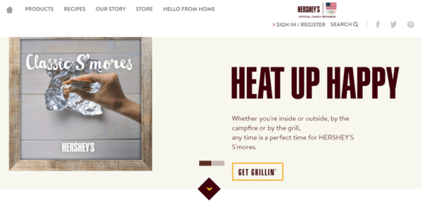
Example
Hershey’s sells Chocolates and an off white background fits its website perfectly not just because it separates the content, but due to chocolate’s main ingredient Milk. Adding perspective to your background color not only serves as a marketing point, but also engages the visitors into action. Secondly, when choosing a background color you must keep in mind that it has some sort of resemblance with other colors from the palette. If you have dark yellow as your footer then you can use lighter tone of yellow for the background.
Using these principles of color management,you can integrate better color combinations to attract more visitors to the websites, achieve higher rankings and therefore get better sales ofyour products. A good looking website not only helps bring more business to the owner but also sets a benchmark for others to follow. You don’t need to be an expert in colors to build a winning color combination, you can use automated tools for it like Adobe Kuler or ColoRotate. With these at hand your can easily create a master color combination that floats the boat of your visitors.
Asad Ali is an expert in digital marketing and web design optimization at GO-Gulf – a Dubai Web Design firm that provides web development and website design services.


