2020 was undoubtedly a year of fast moves and changes in the digital environment. As businesses found their doors shuttered due to the pandemic, they struggled to find ways to continue operations. Cora+Krist quickly mobilized to meet this demand as an agency, but it wasn’t without challenges. Implementing bold designs that meet user experience best practices is always at the front of mind and with that come evolving design trends that can either aid or hinder this effort.
As we move into 2021, the impacts of the last year and the unique demands around helping businesses navigate what is quickly becoming a new digital business reality, attention to design trends has never been more critical. Here are some top trends we see evolving in the coming year and trends we’d recommend avoiding.
- Immersive Visual Experiences: We’re always looking for new and fresh ways to engage the user and keep them interested in the presented content. Using parallax effects and multiple layers to animate the experience helps to compartmentalize content snippets and deliver information in a more controlled and meaningful way.
- Flat Design is Popping with Neumorphism: Playing off the needs around immersive visual experiences, flat elements that were trendy in the past few years are evolving to take on a more 3D nuance and texture. However, this design trend shouldn’t be confused with skeuomorphism, made famous by Apple with the advent of the iPhone. This new approach is still minimal and very chic.
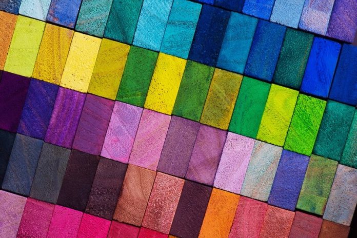
- Color Gradients: This trend started to emerge in 2020 and took hold. The movement and 3D nature that gradients can add to a design further enhance some of the other immersive visual elements and neomorphic trends. Gradients applied as overlays on images, as background elements, and even adding additional interest and pop to call-to-action points help drive visual appeal, brand identity, and attention where it’s needed most.
- Accessibility is Still King: Beneath all the trends, accessibility is still a forward thought for digital design. The need to make sure that designs can accommodate the broader public’s needs and be truly inclusive is ever more critical. When approaching color choices and design, designers need to consider how their creations will be interpreted by screen-reading technology, how the design will be seen by those with color blindness, and those who are visually impaired. Contrast is important, logical textual hierarchy, and large, easy-to-read typography are the three primary considerations.
- Minimalism Drives Conversion Goals: At the end of the day, the design performs its function and does not just look good. Conversion Rate Optimization (CRO) testing has consistently shown that more minimal messaging and design approaches lead to greater conversion rates. This focus on CRO translates to ROI and successful campaigns. Keeping messages short and sweet and lead generation forms to a minimum is key to that first entry point. Save the details for further down the sales funnel. If your first desired action takes longer than 7 seconds to figure out and complete, it’s too complex.
Trends we see that are a concern.
- Abstract Art in Design: This is something that is beginning to emerge. The design and high-art appeal are apparent, but the designs’ complexity often presents genuine accessibility concerns. Usually, the heavy use of color splashes and lines conflict with typography and call-to-action intentions making it difficult for the user to understand where they should be focusing, thus interrupting the conversion process.
If you consider the nuances and details around these trends and maintain focus on conversions and optimal user experience, your digital designs will take on a whole new meaning in 2021 and help drive your organization’s real ROI and results.
Christopher Mohs is the VP of Strategy for Cora+Krist, a boutique digital and business consulting agency comprised of experts from across the globe.
Color gradient stock photo by optimarc/Shutterstock


