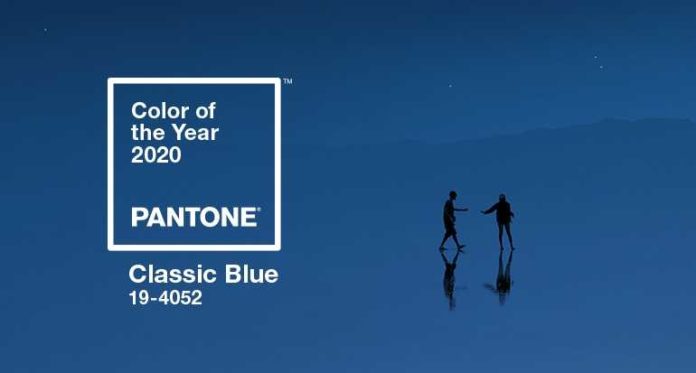
I’m a blue person. It’s long been my favorite color. Apparently I have a lot of company. If you’re one of those who say blue is your favorite color, you’re in luck. Pantone, the global color experts have named “Classic Blue” as their 2020 Color of the Year. (It’s technically Pantone 19-4052 in case you’re looking for the color.)
This means of course that we’ll soon see scores of products in this color, from appliances to cars, to cosmetics to wall color (and other home décor) and more.
Classic blue, says Pantone, “instills calm, confidence and connection.” They say the color “highlights our desire for a dependable and stable foundation on which to build as we cross the threshold into a new era.” By new era, I’m assuming they mean 2020 is the start of a new decade.
Pantone describes the color as “suggestive of the sky at dusk” and as “restful” bringing “a sense of peace and tranquility to the human spirit, offering refuge.” Leatrice Eiseman, the executive director of the Pantone Color Institute, adds, “Classic Blue is a color we can rely on.”
Given that Pantone also says the color aids concentration and brings “laser-like clarity” you might consider painting an office wall this color (but it’s a dark shade, so think about how much natural light your office gets).
Paint companies Sherwin Williams and PPG are also riding the blue train. Sherwin Williams picked “Naval” (SW 6244) as it’s 2020 color of the year, a “rich navy that creates a calm and grounding environment infused with quiet confidence.” And PPG picked “ Chinese Porcelain” (PPG1160-6) a color that offers “escapism in today’s technologically-driven society.” PPG says the color “is a blend of cobalt and moody, ink blue that imparts calmness…while also offering the spirit of hopefulness—a rare commodity in a restless world.”
While I really like these colors, I think everyone is just trying to help the world calm down.
Photo courtesy: Pantone


