
By Lexie Lu
You know that having a contact form on your website is an important part of building trust with site visitors. It gives them a clear way to contact you and ask questions about products or services. However, getting those same visitors to actually utilize the form isn’t as easy as it sounds.
There are many different elements to consider with your contact forms, down to the time of day most people submit them. Here are 10 things to look at if you want to boost your contact form’s conversions and get more people to submit than ever before.
1. Contests Work
If you want to gather in-depth information about your site visitors, then you need to offer them something in return. Surveys show that people will fill out as many as 19 lines of information for a contest, but they are less likely to fill in a lengthy form to simply contact you on your site. If you’re looking to build your mailing list, then a contest may be the way to go.
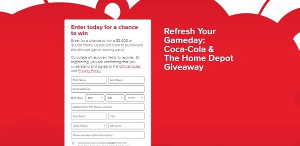
Coca-Cola and Home Depot teamed up to offer a giveaway. The contact form to enter for a chance to win is pretty detailed. Note how the prize is listed within the contact form box and each line is clearly labeled. The entire focus of the page is on the contest form.
2. Wording Matters
The way you word your form can make a difference in conversions. For example, simply adding the word now so your button reads register now results in twice the number of form submissions. At the same time, you don’t want to get too wordy with your submission form. The smartest plan of attack is to try different word combinations and do some A/B testing to see which converts best with your target demographic.
3. Location
Where you place a link to your contact form is important. Keep in mind that some visitors will head to your page with the express intent of contacting you. You need to place the link to your contact form in a location where the site visitor doesn’t have to scroll down to find it. It should be readily visible from the minute a visitor lands on your site. There is a reason why most websites place “Contact Us” in their navigation bar. This is a super simple way for visitors to find your contact page.
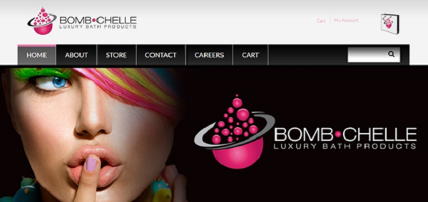
Note how the Bomb-Chelle site puts the contact button right at the top in bold letters so it is easy to find. While you won’t always find this feature on sites of big corporations, small businesses can definitely benefit from the personal touch. A company such as Coca-Cola may not need to build trust, since it already has an established brand, but a newer company needs this personal feature to instill confidence.
4. Time of Day Matters
If you study the time of day people submit different types of contact forms, you’ll start to see a pattern of when you should promote things on social media or to your mailing lists. For example, people submit the most surveys between 10 a.m. and 1 p.m., but they use a basic contact form more between 3 p.m. and 5 p.m. Knowing this basic information can help you understand when to schedule a social media posting about a contest or invite people to contact you and ask questions about something related to your industry.
5. Submit Button
Just as with call-to-action buttons that can drive conversions, a small submit button within your form can motivate visitors. The button doesn’t need to be extremely large. Visitors already know to search for a button that says send or submit. However, it does need to be easy to spot, so making it a brighter color than the rest of the form is a smart idea. You can also utilize an icon for the same purpose as long as it is readily recognizable.
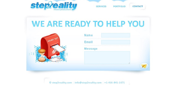
Note how Step 2 Reality uses an icon for its submit form. The icon is in a different color, which draws attention to it. It is also readily recognizable as a paper airplane, showing that you’ll send the message flying through the internet.
6. Confirmation
What happens after your site visitor submits the form is equally important. You should confirm the form was received. Otherwise, the user might not know if you got the message. This can result in two scenarios. Either the user gets frustrated with the process and goes to a competitor for help, or the user submits the form multiple times, filling up your mailbox with duplicate messages.
7. Different Options
If your site caters to different types of visitors, your form should reflect this reality. Rather than having a one-size-fits-all type form, you may want to offer options for your visitors. This allows for a more customized experience.
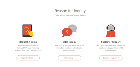
Achieve 3000 does an excellent job of implementing this customized approach on its contact page. When you land there, you’ll get three options that clearly show what you’ll get by using that contact form. It offers the ability to request a demo, ask a sales-related question or get general customer support.
8. Functionality
Your contact form should function well. Have you ever visited a site and taken the time to fill out the information, only to get a failure notice? It’s frustrating. Take the time to thoroughly test your forms and make sure they work on different browsers and without any major glitches. You’ll also want to make sure the forms are coming through on the other end so you can respond in a timely manner.
9. Copy on the Page
Although the form itself, placement and other features are important, you also should consider the copy on the page itself. You can say a lot that will show off the personality of your company and draw readers in. Make sure every word on the page has a specific purpose that ties into your overall branding and company goals.

Note the copy on the Choice Screening contact page. It starts with a strong headline that offers a call to action of “talk to a human.” It then goes into a short paragraph about what your experience contacting the company will be like. This all works together to encourage the customer to make a connection.
9. Multiple Ways to Contact
In addition to a form, consider adding additional ways for people to contact you. More and more people are on social media, so adding links to those pages and encouraging people to reach out is a smart way to start a dialogue.
More Conversions Equal Happy Customers
Customer service is still key in today’s global marketplace. Figuring out ways to make people feel comfortable enough to contact you allows you to meet their needs in a personal and satisfying way and collect information so you can reach out to them in the future with promotions and big news. A good contact form is a must for your website.
Lexie Lu is a freelance graphic designer and blogger. She keeps up with the latest design news and always has some coffee in close proximity. She writes on Design Roast and can be followed on Twitter @lexieludesigner.


