By Lexie Lu
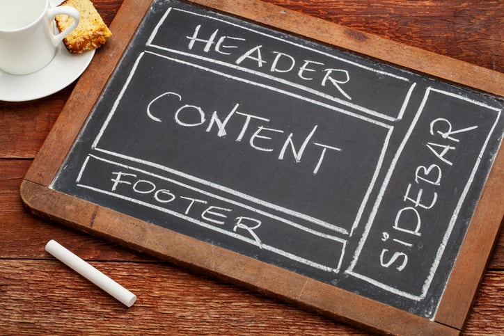
Have you thought about your footer lately? Your website footer may be much more important than you realize. Web designers tend to focus on the top portion of a landing page, and with good reason. The majority of people will hang out above the fold. However, there is a percentage who will either make it all the way to the bottom of your page or will scroll there to find important information.
In one study, there was as much as a 23.77 percent increase in conversions just by improving the footer of a site. That is a pretty good return on investment, meaning it is well worth your time to improve your footer. There are some simple improvements that will make your footer user-friendly and allow it to drive conversions. All the changes required of you are a little time and some smart design work.
1. Show Off Your Personality
Your landing page can be a bit like a mullet haircut: business in the front and party in the back — or in this case, business at the top and party at the bottom. While you might want the focus to be on content or the sales funnel at the top, you can use the footer to really show off some personality and create a bit of fun for your site visitors.

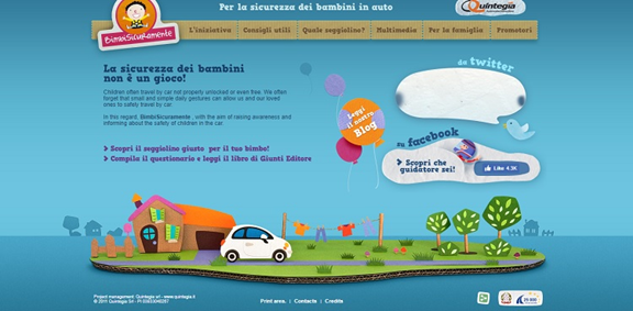
One example of a company accomplishing this is BimbiSicuramente, with a fun graphic design that focuses on the personality of the company before the actual information in the footer. The info and links themselves are very simple — copyright, contact link, credits. The eye is drawn to the colorful hose, car and domestic scene, which shows off how fun the site actually is. The info is still there, it is just presented in an engaging way.
2. Navigation
You certainly don’t need to add every single link to every area on your site, but some key links at the bottom of the page can create a fast path for site visitors. It’s a good idea to add a Home button, but you’ll also want to study some heat maps of your landing page and analyze visitor behavior.
Where on your site do they navigate to the most? What pages are most popular? Consider these for your navigation buttons at the bottom along with vital information such as contact info. You also can simply focus on where you want visitors to go next when they reach the bottom of your landing page.
3. Call to Action
Placing a call to action (CTA) at the bottom of your page can help increase conversions. Visitors who make it that far down may not know what to do next. The last thing you want them to do is navigate away from your site. By offering a CTA, you can convert them down the funnel you’d like.

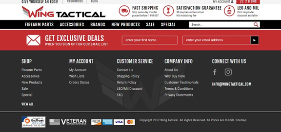
Wing Tactical does a good job of grabbing user attention with a bright red bar in the footer that encourages site visitor to sign up and “get exclusive deals.” This is a great way to convert consumers to your mailing list, where you can reach out to them again and again.
4. Social Media Icons
It’s a good idea to add some social media icons to your footer as well. These days, many people expect those to be somewhere on your page, so they can connect via their favorite platforms. About 72 percent of the top marketing websites have social media icons in their footers, showing how important it is to place these in a convenient and expected place.
You can use a simple icon or choose one that is customized for your site’s colors. You’ll find dozens of options on any stock photo site. Some website themes come with matching social media icons, as well.
5. Add Some Direction
Another interesting thing you can do to ramp up the benefits of your footer is to add directions to a brick-and-mortar store or your headquarters. This can include brief text directions or an integration with Google maps or another type of map software. Google is probably the most intuitive to integrate because of the many mobile users browsing online these days.

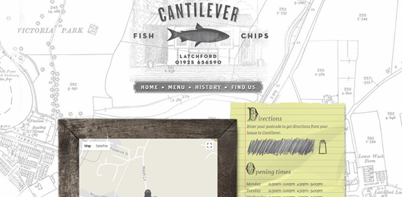
A restaurant, Cantilever Fish and Chips, provides a good example of how to do this effectively in your footer area on its home page. You simply scroll to the bottom, and you’ll be invited to put in your postal code. Directions from your house to Cantilever will pop up, along with a map.
6. Most Important Things on the Left
For websites in English, it is a good idea to place the most important information, or those items you want readers to respond to, on the left. The reason is that English speakers read from left to right, so they will pause on items on the left before moving to the right. In fact, it is estimated that website visitors spend almost 70 percent of their time on the left half of the page and only 30 percent viewing the right side. By putting the most important items in that location, you grab the reader’s attention right off the bat.
Many designers spend so much time designing the header that they tend to forget just how important the footer can be to overall conversions. Each part of a website is important if you want to hit maximum impact from the traffic you receive.
Remember that your footer is the last thing on your page many visitors see. Some might argue it is even more important than the other parts of the page because it leaves a final impression on site visitors. Regardless of how important you think it is, using the tips above and paying more attention to the layout and design of the footer can result in more conversions for your business.
Lexie Lu is a freelance graphic designer and blogger. She keeps up with the latest design news and always has some coffee in close proximity. She writes on Design Roast and can be followed on Twitter @lexieludesigner.


