
What’s the Best Option for Displaying Products on Mobile?
By Haresh Kumar, VP of Marketing at Moovweb
Mobile shoppers are notoriously fickle. Forty percent will visit a competitor’s siteafter an unsatisfactory mobile experience.
Frustrate your mobile users by picking the wrong way to display your products, and you will lose them.

What, therefore, is the best practice for displaying products on a smartphone screen – list or grid view?
We analyzed leading retailers’ mobile sites and gathered some interesting insights about how they’re adapting their desktop experiences to mobile.
AND THE WINNER IS…
Our first goal was to determine which view was the most popular option among top retailers on mobile.
Among our customer base, which includes many of the country’s leading retailers, the split between those using list versus grid view on mobile was about 50/50.
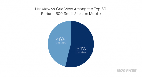
To expand on our customer-based insights, we did additional research based on the top 50 Fortune 500 retail sites.
We found a similar distribution, with slightly more retailers using a list view. A grid view was used on 46% of the top 50 sites, and a list view was used on 54%of those sites.
On desktop, among the top 50 retail sites in the Fortune 500, 24% use list view and 76% use grid view on desktop. This means about ¼ of the retailers used different types of views on mobile versus desktop.
Clearly what works best on desktop does not necessarily work best on mobile. But how can retailers decide which type of view to use on mobile?
A GENERAL RULE OF THUMB
A key factor in selecting list view versus grid view is how much information a customer needs in order to choose between products.
On desktop, you can use a grid view to display dozens of products per page and still convey a lot of information about each product.
On a smartphone, however, the smaller screen makes displaying lots of product information in the grid format more challenging.
Therefore, for products like appliances, auto parts, and office supplies – where details like dimensions, discounts, model numbers, and ratings are major factors in the selection process – the list view makes most sense.

Home Depot, Lowe’s, Best Buy, Sears, Staples, Office Depot, and AutoZone all use the list view, for example.
For products like apparel, where the selection tends to be vast and less product information needs to be considered when choosing between items, the grid view is frequently used.
Macy’s, Kohl’s, Gap, Nordstrom, JCPenney, Neiman Marcus, and Urban Outfitters, for instance, all use a grid view as their default view.

There are of course a number of exceptions, but as a general rule of thumb, a grid view is a good option for sites with products that require less product information.
LETTING THE USERS DECIDE
About 16% of the sites we researched offered mobile users the option to choose between a listview and a grid view.
Interestingly, only one of the sites that enabled mobile shoppers to choose between list and grid views offered the same option on desktop.
This indicates the choice between views is largely a mobile-specific optimization. And it does represent a great step toward providing a better shopping experience on smartphones.
However, most retailers are still missing out on the opportunity to take it one step further.
All of the retailers in the 16% of top sites in the Fortune 500 offering both views, for instance, display the same information for both types of views.
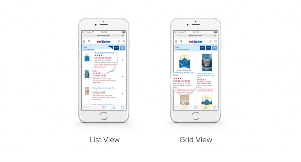
Petsmart, to pick just one example, has all of the same info in the list view (the ratings, the sale price, the regular price, the message about saving 10% with store pickup) also in the grid view.
The company is missing the opportunity to provide a unique enhancement of the shopping experience with each view.
If Petsmart were to display less information and use smaller images for the grid view, for example, then smartphone shoppers could view more products at a time by selecting the grid view.
This would enable mobile shoppers who were in a hurry to more quickly scroll through the product options, providing a distinct advantage over the list view.
HARNESSING THE POWER OF VIEWS
One brand which does an excellent job of providing mobile shoppers with different experiences based on the view they choose is the handcrafted leather bags retailer J.W. Hulme. [full disclosure, this is a Moovweb customer]
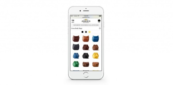
One grid display option shows just images, with no additional information. A smartphone shopper using an iPhone 6, for example, can see twelve bags at a time.
This is ideal for shoppers who want to just quickly scroll through and pick a bag based on how it looks, before clicking in for more details.
A second grid option has slightly larger images, and the name of the bag and price are displayed as well. This allows the iPhone 6 user to still view four bags at a time but get a little more info about each bag before choosing which tile to tap for more details.
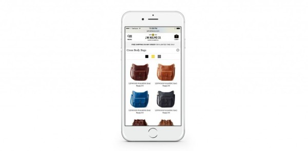
The third display option is a list display, with a much larger image of the bag. The product name and price are also displayed.

The user can only view one product at a time, so they’ll have to do a bit more scrolling to get through all the bag options. But they’ll be able to get a better look at each bag, and they’ll know key product details.
BEYOND LIST VIEW VS GRID VIEW
Deciding whether to use a grid view or a list view is key.
But beyond that, retailers should also be thinking about taking advantage of the special features of smartphones, such as the ability to swipe, to provide better experiences.
One example of this is the Macy’s mobile experience. On mobile, Macy’s enables users to switch between a grid view and a swipe-based view.
The swipe and shop feature allows shoppers to browse products with a thumb swipe and add products to their shopping bag with the tap of an icon.
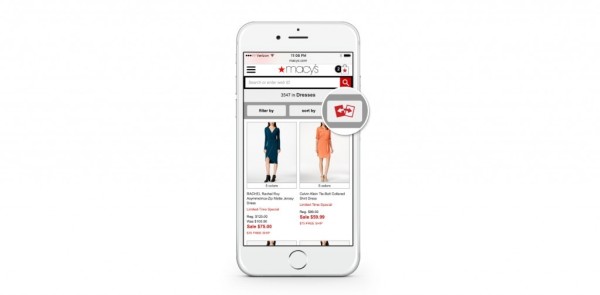
Only a few retailers, such as Macy’s and Forever 21, currently offer the swipe feature. But as retailers begin to focus more on mobile, testing alternate ways of displaying products in a manner that is unique to mobile will no doubt become a priority.
IT’S ALL ABOUT THE CUSTOMER EXPERIENCE
Ultimately the decision to use list view versus grid view should be aligned with your overall mobile strategy and what is most valuable to your users.
If they value seeing additional information about products like discounts and ratings, you should consider using a list view.
If your customers prefer to quickly swipe and see as many options at a glance as possible, you should go with the grid view.
The key is providing optimized mobile experiences that meet your mobile customers’ unique needs.
Haresh Kumar has more than 15 years of experience in marketing, product, and strategy for world-class enterprise brands. He is responsible for extending thought leadership and driving overall marketing and communications strategy at Moovweb, the fastest-growing mobile solution helping companies to deliver better mobile experiences.


