
By Rhianna Camp
If you haven’t optimized your website for mobile users then you are losing out on potential customers. Nowadays nearly everyone uses a smartphone or tablet to browse the internet: some don’t even both using a desktop computer or laptop any more.
A responsive website is more important than ever, yet many businesses, and their owners, seem to ignore the mobile version of their site.
Why It’s Important
With people seeking to be more connected when on the go, smartphones are now an integral part of our everyday life. In fact, the amount of traffic that comes to websites via mobile devices has been constantly increasing over the years which means that making sure your website is mobile-friendly is more important than ever for the following two reasons:
Firstly, Google have been becoming stricter on how they rank websites in their search results. If Google does not think your site is mobile-friendly then you risk having your website demoted in their Search Engine Results Pages (SERPs).
Secondly, Google also announced that they are developing a separate mobile search index which will be the primary search index for search results. Google has started experimenting with a mobile-first index that primarily ranks sites based on their phone-friendly pages. This suggests that the PC will no longer be the absolute centre of Google’s search universe which means that it’s crucial to have a responsive site so you and your business aren’t missing out on potential customers.
Three Tools and How to Get the Most Out of Them
Google’s mobile-friendly test
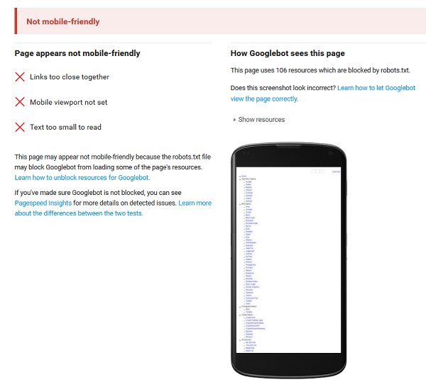
The quickest way to check whether or not your site is mobile-friendly is to use the free mobile-friendly that test Google has provided. This tool can check one page at a time so, while it does not look at your entire site, it is a good way of seeing how your web pages are viewed by Google. If there are any areas that you need to fix in on-page content the test will let you know.
It only takes a few seconds to run the report and get useful advice back from Google on the fixes you may need to make. The example site below is not faring well in Google’s mobile index and, as you can see from the test, the links are too close together, the viewpoint has not been set and the text is too small to read:
Google’s PageSpeed Insights
It’s no longer just about how good your site looks when it comes to whether or not your website is mobile-friendly. With more traffic coming from mobile devices, the speed at which your site loads is now playing an increasingly important role in how your site is ranked by Google. Your page load speed also has a massive impact on the usability of your site because the longer a user has to wait for the page to load the less likely they are to stay on your site, and ultimately, the less likely they are to purchase from you.
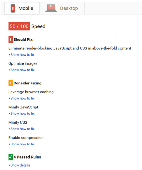
Another useful free tool from Google is their PageSpeed Insights which can test a single page at a time on your website and give you feedback on any issues that may be causing your website to load slowly.
The example below shows there is lots of room for improvement when it comes to speed because of JavaScript and CSS issues and issues with images on the website:
Analytics Data
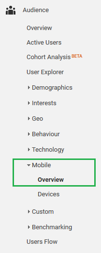
Another way of discovering how mobile-friendly your site is, is to make use of your Google Analytics account. It’s a powerful tool when it comes to keeping an eye on the traffic your website receives and it allows you to get an idea of how the visitors to your site are interacting with it. When it comes to getting a feel for how friendly your website might be the place you need to look at is the Mobile Overview section. This can be found under ‘Audience’ in the navigation.
This section of your Google Analytics account allows you to easily compare the volume of traffic coming from each of desktop, tablet and mobile devices. One thing certainly worth looking out for when comparing the three device categories, and how they interact with your site, is to take a look at the bounce rates. The bounce rate refers to the percentage of users leaving your website without exploring it past the page they first land on so ideally you are typically looking for a low bounce rate. A good indicator that your site might need optimizing for your mobile users is a high bounce rate in your mobile device category.

Checking Your Website for Yourself
As well as using the above-mentioned tools from Google there are some manual checks you can carry out on your website to help identify whether your website is friendly to your customers on mobile devices.
Does your content fit on the page?
One of the most common reasons why your site might not be considered mobile-friendly is when the content doesn’t fit onto the screen when viewed on a mobile device. If there is content disappearing off the screen it creates a horizontal scrolling effect on mobile devices. This has a major impact on the usability and readability of your site on mobile platforms, not to mention your rankings in Google’s mobile SERPs. If you have contact forms on your website then you will need to make sure they are optimised for mobile use as sometimes they do not automatically resize to fit mobile width.
Are Your Links Clearly Visible and Readable?
The ability to navigate around your website easily is a key factor of how friendly your website is. It’s frustrating for users if a poor navigation system and small site links mean they struggle to get around your site: by having small links which are close together it’s all too easy for your users to accidentally click on a different link than the one intended. In order to avoid this common error make sure that your site links are a decent size and that there is a gap between them.
Is Your Key Information Readily Available and Clearly Visible?
With any website it’s important to have your key information, such as contact details somewhere on your site, however, it’s even more essential if you want to ensure your site is mobile-friendly. The best place to put your phone number is in the header of your website, because putting it in a prominent position can boost your enquiries as it gives potential customers trust that they can call you if needed. The header is also a place to show any social links you have. Your address is best placed in the footer as it will help Google determine your location which is extremely important for local results, particularly when it comes to mobile searches.
Internet usage on handheld devices is growing and is only going to continue to grow – making sure your website is mobile-friendly and optimised to convert mobile users has never been so important.
Rhianna Camp is a web developer at Receptional Digital Marketing


