
When it comes to advice on landing page design, you’ll find people who suggest throwing many different elements into the mix and others who advocate for a narrow focus. If you want to increase conversions, keeping the page’s goal in mind and creating a simple but engaging design should be your top priority.
Minimalism is a classical approach if you want a landing page that never goes out of style. This design requires a balance between positive and negative space. The eye is then drawn to only the most critical elements. If your objective for the page is to have the user click on a call to action (CTA) button, the focus goes there.
Creating a simple but stellar landing page requires several clear steps. We’ve also found examples of some of the top minimalist designs out there. One of the best ways to learn a design style is by studying what others are doing right.
1. Cut Any Clutter
It’s tempting to add a lot of information to a landing page. After all, you want site visitors to know everything about your brand and what you have to offer. You might also worry they’ll land on the wrong page and have trouble navigating to the correct one. In an attempt to be everything to everyone, though, you’ll wind up with a confusing and hard-to-navigate site.
Instead, think about the goal for the page and get rid of anything not matching your purpose.
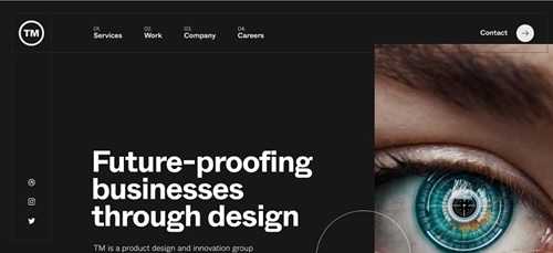 TM is a design firm. Its minimalistic design puts the focus on its work, which is the only animated element on the landing page. The images morph through several photographs and grab user attention. Even the navigation on the page is simple, only giving four options and some links to social media accounts. All clutter has been removed, and there is a nice balance of white space.
2. Know Your Purpose
Think about the purpose of the landing page. You might have different objectives for various sections of your website. However, each landing page should have one central focus, and all the attention should go toward the purpose. If your goal is to get customers to share their email, then the page’s focus will be a signup link, for example.
Once you understand what you want visitors to do when they land on your page, it’s much easier to create every element of your design to guide users to the purpose. Use arrows, photos of humans looking toward an object and contrasting colors to draw the eye.
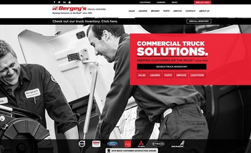 Bergey’s Truck Centers does an excellent job of pointing the user toward the next phase of the buyer’s journey. Note the “Search Truck Inventory” call to action button. It’s set off with a red background and a pop of black, drawing attention. The background image is of two men, and the first one seems to face the CTA, further pointing the way to clicking on the button. The design is both subtle and bold at the same time.
3. Engage Your Visitors
If you want to increase your conversions, you have to grab site visitors’ attention from the second they land on your page. You’re competing for the attention of a public with numerous distractions. You must hook them with your headline and then keep them there with interactive elements.
There are many different features you can add while still keeping your design simple. An explainer video tells more than you can with hundreds of words. A relevant image summarizes what you offer. A fabulous CTA guides users where you want them to go.
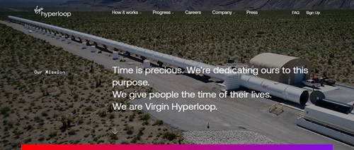 Virgin Hyperloop runs a hero shot video in the background of its home page. It superimposes a headline over the video, but the focus is on the train’s speed and the expanse of it. The user immediately feels connected to the project and excited about the possibilities.
4. Use One-Click Signup
Signing up for your newsletter or getting a free download should be as easy as clicking a button. Look for ways to simplify your conversions. If you can integrate your site with social media, such as a button saying “Use Facebook to Sign Up,” you’ll increase conversions.
Walk through the process and look for steps you can cut. How can you make it as easy as possible? Just gathering an email at first allows you to stay in touch without asking for endless details about the user’s life. As they get to know your brand and what you stand for, they may be more willing to share personal data.
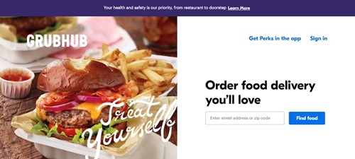 Grubhub wants you to start using its app. One of the easiest ways to get you onboard is to show what’s available in your zip code. There is a simple signup on its landing page that asks for this information.
5. Add Elements in Phases
If you have a more complex structure to your site, look for ways to simplify things while keeping users engaged. You can unveil different elements a little at a time. Another idea is to add a mega menu, so users can click on a category and then see the many other options available under subcategories.
 Antyfest starts with some simple flat illustrations. It adds one element at a time, so the user isn’t overwhelmed. The animation captures the imagination, and site visitors wait to see what is unveiled next. While the finished page has several elements on it, by the time the user gets through the phases, they’ve likely already found what they need. The site is simple but has layers that make it more complex at the same time.
Start Small
The best way to create a simple landing page is by starting with a single element. Add only the things you must have. If you already have a website and the design seems overly complicated, set it aside and start from scratch. It’s better to work a little harder for a site that engages people than to try to fix something that isn’t working.
Lexie Lu is a freelance graphic designer and blogger. She keeps up with the latest design news and always has some coffee in close proximity. She writes on Design Roast and can be followed on Twitter @lexieludesigner.
Landing page stock photo by Mila Supinskaya Glashchenko/Shutterstock


