In this article, we will take a look at how having too many options on your website can damage your conversion rates massively and why you should concentrate on quality instead of quantity.
Too many choices, in general, can be quite distracting and can turn off potential customers in any field of sales. The answer is psychological, and it has everything to do with being overwhelmed by the choice. But doesn’t having more choices give you more freedom and flexibility, you might ask?
It is true, but don’t you get confused by a large number of choices sometimes? Try to remember the last time that this happened to you. The user might get overwhelmed by the sheer amount of information and choices exploding from the screen, bombarding the user since the first second, and they end up leaving confused. Let us take a look at how you can remedy this and avoid falling into this pitfall yourself.
Too many options occur psychological trigger
This was, in fact, scientifically proven by many studies. For example, researchers set up a table with jams, some with 24 samples, and some with just 6. People spent more time in the shop when they had more options, but they were less likely to buy the goods.
 There was another study which was focusing on brain activity during the test. People were asked to make a decision while lying in an MRI machine. They were shown either 6, 12 or 24 pictures. Based on the results, brain activity was the highest when they had to choose from 12 options. It means that with this amount they were able to weigh up costs and benefits, and also to determine value.
Having more choices on your site might cause an effect on customers called the buyer’s remorse. This is what happens when too many options are offered and when customers choose one thing they instantly regret it because they feel like they couldn’t make the right choice.
Another psychological trigger is analysis paralysis – this effect occurs when customers have too many options and think too long before making the decision, then end up not choosing at all.
 As we can see, having too many choices can decrease the number of customers, but how does this apply to your website and conversion rate?
Strive for quality, not quantity
It all begins with the landing page – it should have one call to action button which should be well visible and also have only the necessary information on it. What you want to avoid is having too many elements on the landing page, because this is where users get attracted to your site. So make sure that you put your most attractive content on the landing page, and one CTA for a smoother experience to boost conversions.
Another example of this – having too much choice – might be seen in the way you offer social media sharing. On so many sites nowadays you can see share buttons that allow you to share content on social media. Well, the amount of choice as to how many social media options are present differs; but it is usually advisable that you offer only one or two social media sites to share the content on, and make the buttons more visible. This will increase the number of times your content gets shared.
 You should strive to do this on every page of your site, or as often as possible. On every page, blog post, site post, and even e-mail promotions and offers, you should strive to bring quality content and one CTA button.
More options equal more conversions
Of course, having too many options can kill your profits in certain circumstances, especially on landing pages, e-mail marketing, and your blog posts. But in some cases, having more choices can do a better job to streamline the choices down to a single choice.
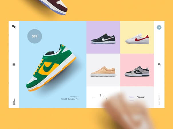
Many people claim that more options equal more conversions. But these options should be presented in such a manner that they attract users, and the page should still have a clear goal. The content should be quality, organized become a mess is just unappealing to anyone. Of course, it is great to have more choices if you own an e-commerce site, for instance. Good advice for such sites would be to narrow down a selection of products and show fewer products on one page instead of more.
 (Source)
Having content in different forms (write blog posts, create videos or make infographics) can benefit your business. It is also beneficial to be available on more portable devices such as phones and tablets.
Conclusion
We have established in this article that having fewer options on your site might boost your conversion rates. There are multiple scenarios where this might be applicable.
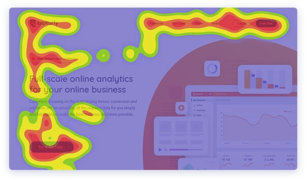
Sometimes, more options work for some people, while for others it is not good. Some people are attracted by a more simplistic outline. You should get to know your visitors and customers, many web analytics tools can help you with that. With different types of heatmaps (scroll heatmap, click heatmap and segment heatmap) you can analyze your customer’s behavior, so you’ll be able to decide if they prefer fewer or more options. Maybe you have the right amount of CTA but at the wrong place and that’s the reason for the lack of increasing conversion rate. The importance of web analytics is unquestionable.
It has been scientifically proven that having too many options might kill profits. This is also a proven technique in the CRO field where people strive to have quality instead of quantity and especially is that the case for landing pages. Hopefully, you have learned a valuable lesson in this article and we hope that you implement this idea on your site successfully to great effect.
Evelin Rácz is the Content Marketing Manager of Capturly, a full-scale online analytics tool that can provide online businesses with first-hand feedback and real business insights simply and intelligibly. Connect with Evelin on Twitter and LinkedIn.


