")
Each year a few new trends disrupt the whole graphic design world. And 2020 is going to be no different.
The last few have been dominated by bright colors, striking graphics, and futuristic influences.
But this year, designers are taking a slight step back from the bold and brash, to something a little more reserved.
This major shift has mostly been driven by the overuse of some of those once-popular design tactics.
So to stay ahead of your competitors, be sure to check out some of the new graphic design trends for 2020 below!
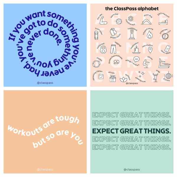
1. Muted Color Palettes
Like I said above, expect the graphic design world to be a lot more reserved this year, especially when it comes to color palettes.
Muted colors are actually going to be a lot more popular than vivid and bold colors in 2020.
In fact, massive companies like Apple, LinkedIn, eBay and more are already using these colors across their brand:
 Source
If you’re not aware, muted colors are created by adding black, white or a complementary color to the original color.
A simple way to describe these colors is that they are basically the opposite of vivid colors.
Now because muted are created by adding black or white to the original color, they work well with neutral tones.
Just check out how Ellevest uses these muted colors in their social media images below:
 These simple muted colors make the graphic above feel very trendy and modern. Using vivid colors used this year wouldn’t have the same effect at all.
But I think the best part of using muted colors is that they don’t overpower the rest of the graphic.
That means you can easily use a muted color as the background of your graphic without distracting from the written content or other elements:
 Source
Even on small screens, you can easily read the text and see what each of those examples is trying to communicate.
So if you are wanting to update your graphic design toolbox for 2020, I would by using more muted colors across the board.
2. Abstract Illustrations
Using custom illustrations in your graphics or marketing materials is always a good idea in my book.
No other company can copy an illustration like they could a stock photo or simple graphic. Plus you can inject a ton of your branding into each custom graphic.
The mattress innovators over at Casper were one of the first large companies to embrace this trend:
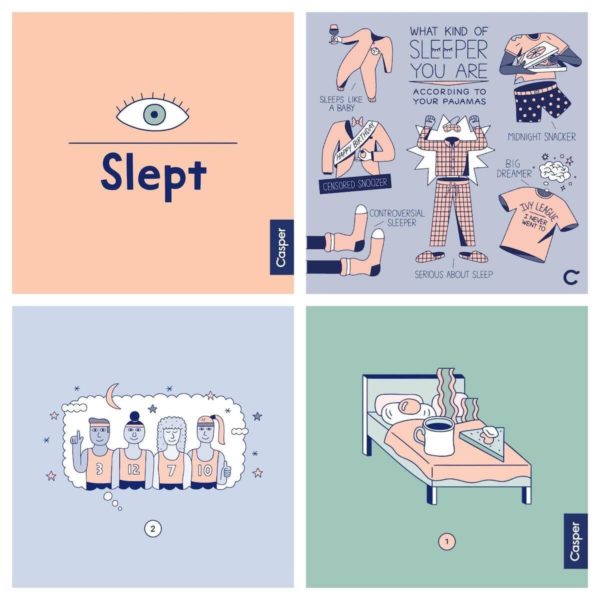 They also seem to be using one of our other graphic design trends, muted colors, as well!
However, after a ton of companies started using this approach, it started to lose its effectiveness.
That’s why to stand out this year, your illustrations are going to have to be somewhat abstract, exaggerated and dreamy.
Not sure what I’m talking about? Check out some of the images Doist has been creating lately:
 Here is another great example from Bon Appetit:
 Both of those examples are going to stand out on a crowded social media feed. And when your company is already in a very competitive industry that can be a huge benefit.
Plus, because your brand is creating these illustrations you can fit the topic of your blog post or share almost perfectly. No more settling for boring stock photos!
 Source
The only downside to these graphics is that it’s a little difficult to create a consistent visual brand. And sometimes your followers might not know a graphic was created by your brand.
So make sure to slap your brand mark or logo on these innovative graphics like Slack does:
 Now your followers will automatically know your amazing designers created that graphic.
3. Extra Heavy Fonts
If you have been paying attention to this article, you might have already spotted the final design trends in a few examples: extra heavy fonts.
This really shouldn’t be that big of a surprise because bold fonts have been extremely popular recently.
However, this year things should get even bolder, with heavily weighted fonts being used a lot more frequently.
With a simple heavy font, you can direct a reader or customer to an important piece of content or title. In this example from Hootsuite they used a bold font for the title of each blog post:
 Source
In most cases, the image or icon is the main focal point of a social media graphic like this. But the heavy font makes the blog titles the most important part.
Now like with muted colors, these heavy fonts can give your graphics a more modern, refined or professional look in 2020.
 Source
Adobe uses a heavy font very well in the example as well:
 When a strong font like this is combined with a muted or reserved color palette, it creates a very eye-catching graphic.
I would only recommend using these heavy fonts for short ideas, titles, or phrases. For example, this infographic only uses an extra bold font in the title section:
 Otherwise, these fonts will lose all of their power and people will struggle to read your content.
That’s all I have for now! But be sure to check out this article if you want to learn more about the 2020 graphic design trends!
Ryan McCready went to the University of Arkansas and graduated with a degree in economics and international business. Now instead of studying the economy, he writes about marketing, graphic design and social media trends.


