")
Why does your homepage exist? If you’re not careful, then you might fall into the trap that most business owners fall into. What trap is that?
Filling your homepage with enough distractions to confuse visitors effectively enough that they hit the back button and leave your blog.
It’s good to sit back and carefully consider the purpose of a homepage in relation to a thought you most likely have at least 11 times per day:
How do I get more leads and sales inside my business?
I’m about to expose the misconception that an overly-informative homepage is an effective homepage.
Let’s dive in.
Too Many Choices Create Confusion
It’s a fact that too many choices lead to fewer actions taken.
You might think that you need all of the following elements on your homepage:
- 6-9 links to your blog posts
- A list of links to all your products or services
- 3-5 “About Us” paragraphs
- Testimonials
- Social proof icons
- A couple lead magnet opt-in opportunities
And you would be incorrect with this line of thinking.
It’s not your fault.
We’ve all seen homepages that clutter their visitors’ minds in this way, so it’s become a standard way to create a homepage web design.
The “normal” way of doing things isn’t always the most effective.
Here are the three homepage elements you need if your goal is lead generation and sales:
- Lead magnet opt-in opportunity above-the-fold & at the bottom of your page
- Social proof
- A story that encourages the opt-in conversion
That’s it!
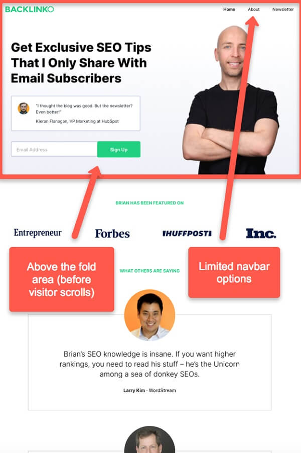
Element 1: Lead Magnet Above The Fold
The only thing your visitor should see above the fold is a straightforward call-to-action (CTA) to become a subscriber.
Making it easy to say yes is a foundational element of online conversion optimization.
Keep your navbar simple.
Limit it to three choices so that your visitor doesn’t get confused.
Flow your visitor’s mind into one CTA:
Become a subscriber.
Think about it.
Did you start your blog for traffic vanity metrics or to make leads and sales?
Rhetorical question 🙂
Let’s look at examples of this above the fold method:
- Backlinko.com
- Detailed.com
- LAXgoalierat.com
Notice how limited the choice is above the fold.
I think the first and third examples do a better job of limiting navbar choices than Detailed.com does. However, they all show you the style you’re after.
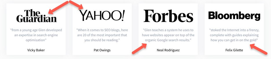
 Element 2: Social Proof
Flow your visitor’s eyes into a social proof section if they decide to skip opting in.
There are two ways to show social proof quickly:
- Testimonials
- “As seen on” icons
Take note of how Detailed.com combines the two by showing where they’ve been featured with supporting quotes.
Damon does a fine job in this section at LAXgoalierat.com.
Use this method and instantly get your visitors into a more receptive mode via social proof.
Element 3: Quick Story That Encourages The Opt-in
The next thing your visitor should see is a quick story that provides context around:
- Who you are
- What you do
- The problem you solve
I think Glen at Detailed.com does the best job of this when compared to my other two examples.
Read his story and notice how he weaves in just enough information to help you understand who he is, what his company does, and the problem they solve for clients.
It’s short and concise.
He also doesn’t simply explain things.
Glen paints a picture by showing well-placed images.
 Ask yourself how you can duplicate this process.
Remember that your homepage doesn’t exist to “close the sale”.
It exists to gain a new email subscriber.
You then teach, nurture, and sell via email content.
Don’t miss a critical thing that Glen does with his quick homepage story:
It ends by seamlessly encouraging his visitors to opt-in to the same offer he presented above the fold.
Duplicate that process on your blog.
Make sure your quick story flows into the opt-in call-to-action:
 Pitfalls To Avoid
The challenge you’ll run into with this homepage method is that you’ll fear leaving out those links to your blog posts, the 15 navbar options, or your confusing list of seven services that you offer.
Dismiss this different homepage strategy at your own peril.
Try it and test it.
Be willing to experiment.
Notice how Brian at Backlinko.com doesn’t even have a quick story.
What do you do with all that other stuff, such as your 15 navbar options or About Us page?
Include those in your footer, just like the three examples I’ve provided you have done.
Bottom line?
You’re hurting your business and your customers by providing a confusing homepage with too many options.
Use these three simple homepage tweaks to get your visitors in as subscribers.
You’ll find that clarity equals higher opt-in conversion rates so that you can sell more on the back-end.
Tim Guga is the founder of Capiston.com. When he is not working, he is dancing salsa or reading a book.
Homepage stock photo by Rawpixel.com/Shutterstock


