How can your business incorporate this year’s chosen hue?
By Rieva Lesonsky
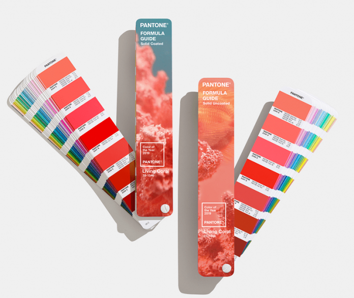
The Pantone Color Institute always makes big news when it announces its color of the year. This year’s choice—Living Coral, which Pantone describes as an “animating and life-affirming coral hue with a golden undertone that energizes and enlivens with a softer edge”—took some by surprise.
Prior to last week’s Pantone announcement, the leading paint companies had already named their colors of the year, which range from moody blues (Blueprint from Behr and Nightwatch from PPG Paints) to earthy tones (Cavern Clay from Sherwin-Williams and Spice of Life from Dunn-Edwards). All are far more mellow than the nearly neon tones of Living Coral.
Pantone’s color of the year usually finds its way into the marketplace quite quickly. The choice impacts “product development and purchasing decisions in multiple industries, including fashion, home furnishings and industrial design, as well as product packaging and graphic design,” Pantone says.
So how can your small business jump on the Living Coral trend? Adobe announced it is “especially excited about…Living Coral [because it] exemplifies major cultural themes identified in the 2019 Adobe Stock Visual Trends forecast.” If you want help figuring out how to use the color, check out the stunning visuals in Adobe Stock’s dedicated gallery or on the Adobe blog.
“Creatives often embark upon projects…searching for design elements to work with that they know will resonate with viewers. Identifying visual trends like Pantone’s Color of the Year helps designers make artistic decisions that they feel confident will look leading edge to viewers, as well as clients and their customers,” says Brenda Milis, Principal of Creative Services and Visual Trends for Adobe Stock.
Want to incorporate Living Coral into your store or office now? Apartment Therapy has identified several coral paint colors you can buy today. And Apartment Therapy got feedback from several designers, who mostly agreed Living Coral is a happy color. Vogue has some insight as well.
Pantone says, in part, it chose Living Coral because it “welcomes and encourages lighthearted activity…and symbolizes our innate need for optimism and joyful pursuits.”
It’s hard to argue that we could all use a little more joy in our lives, so I’ll be on the lookout for a Living Coral pillow to add some fun to my home office.


