")
Your proposals are much more competitive in nature, your ads are laser chosen, and you’ve tested and tweaked your landing page in order to achieve the highest possible conversion rate ever.
FACT: Your higher conversion rate increase won’t come from the new ad you make; they’ll come from the landing page that you will test.
FICTION: Landing page testing is complicated and expensive.
The main objective of this post is to share some proven ideas to test and try on your own site in order to increase your landing page conversion rates and lower your cost per acquisition.
- Add the Magnetic Headline & Value Proposition
The headline is one of the first things a person sees when he/she visits on your site. But did you ever realized that on average, only 2 out of 10 people continue to read what’s written after the headline?
The main objective of your headline should make your visitor feel compelled enough to read whatever’s written next.
First of all, let me tell you the most important thing is that your landing page lives or dies on the quality of its headline.
But a brilliant person does what it’s meant to do—keep your reader on the page so that they will read the next line.
A good landing page headline:
- It should match with the copy from the traffic source page.
- Clearly describe the benefits of your offer.
- Provoke your readers’ interest so they feel impatient to know what’s next.
- Fulfills readers’ needs because people want to know what’s in it for them.
- It should be realistic. Doesn’t make it wild, unbelievable, far-fetched claims that put people off
 The higher the percentage, the more is the emotional marketing power in your headline.
Same as your headline, your value proposition is also important. That must be unique for your business, like your USP, and it’s somewhat similar to what you’d want to deliver in your headline.
- Save the Copy Scent between the Source Page and Landing Page
Readers will visit on your landing page from somewhere. Might be they have come from:
- A PPC ad
- Organic search
- A guest post
- A social media post
- An email newsletter
Whatever the source may be, users must have a smooth transition to move from the source page to your landing page. If there’s any hint available for the disparity, you will face leaking conversions because many users return back soon after landing.
In order to keep the copy scent between the pages you must follow these steps:-
- To continue to the same topic on the traffic source page.
- Utilize the same keywords in your headline.
- Use the same language throughout the copy.
- Use a same design for the landing page and ad.
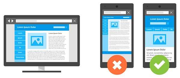
- Make Sure That Your Page Is Visible On Mobile Devices
There is no doubt about it; we are living in a mobile-first world.
Since most of the people search on mobile devices, if your page doesn’t offer an amazing user experience for them, you’ve just thrown away 53% of your traffic. Your campaign fails before you even begin.
First, you should get a mobile-responsive landing page builder. That’s the base. In general, a mobile-optimized page increases your chances of attaining positive responses from your audience.
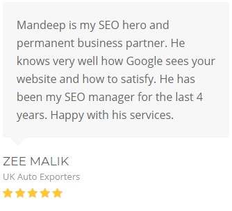
- Add Powerful Testimonials
Positive seal of approval offer your visitors assurance that you’re legit – if they’re done right.
Word of mouth is one of the most powerful marketing there is, and client powerful testimonials, reviews, and seal of Approval are your closest thing to social proof.
Many companies deal with landing page testimonials that are way too generic and weak. They’re simply but unbelievable.
Nobody can do business with your company if they don’t feel comfortable when they are with you.
Trust is a big wheel of business, especially online where fraudsters hide in every corner.
People like to do business with people whom they know, understand and trust. Authentic testimonials create trust quickly.
In short, you can develop credibility and increase conversions through timely testimonials on your landing pages.
- Craft a Call to Action (CTA) Button
Sometimes the call to action (CTA) on your button is more relevant than what the button looks like, and it’s also very simple to test.
By adding some relevancy and value to the button’s CTA and also changing the form of the title, the landing page conversion rate got increased by 31.54%.
Here are suggestions for testing your button CTA include:
- First, test the font color.
- Test using “My” instead of “Your.”
- Don’t centralise on what a visitor has to do, focus on what they’ll get.
- Change verbs to “Get” where it makes sense.
- Test a right pointed arrow located on your button’s left side.
- Add value and relevancy to the button.
- Test a headline CTA and a subhead CTA.
Just remember one thing, a landing page is made to drive one action, and one only.
 You must have a call to action so that those who don’t like scrolling get a chance to convert before they click away. And say your reader what you want them to do:
- First, Sign up for a free trial.
- Second, register for a webinar.
- After that, Book an appointment.
- Then, Download a free report.
- Lastly, watch a product demo.
To force readers to take action, you must craft a pleasing call to action. For your CTA to compel readers to click, it must be:
- Clear, not clever.
- Short, not long.
- Active, not passive.
- Direct, not indirect.
- Obvious, not hidden.
- Include Visual Indication to compel Visitors to Take Action
Visual indication may look insignificant, but they help you to crack the deal.
As I noted earlier, people are visual beings. Strategically placed visual clues attract visitors’ attention towards key page elements.
Here Are Some Quick Suggestions:
- Use arrows to visualize readers’ towards your call to action.
- Human eyes can be used as a directional indication by making people in hero images focus on an important element on a page like a headline or CTA.
- Use hands as a direction by having images of people pointing at a specific element.
- Use lines to point out certain parts of the page because humans are eager to follow paths.
 An admirable 12.6% of visitors who interact with a chat bots sign up. Some extra visual indicators draw attention and motivate visitors to talk with a Chabot. Adding a simple emoji can help to increase the number of interactions by 313%. You can utilize the same strategy on your landing pages. In essence, visual clues can also help to influence visitors to convert.
- Try on Testing and Tweaking to Improve the Page’s Performance
A landing page is not the thing which is set once and forgets other things.
It’s a live page that needs time to time revisions for the best results.
Gone are the days of waiting for weeks for campaign numbers to come in so that you can adjust your approach. Today, you have several tools like Optimizely at your disposal in order to help you in testing your page as soon as it goes live.
Conduct split tests on you’re:
- Headline.
- Hero image.
- Body copy.
- Form fields.
The possibilities are endless. Once you get the winning version of the element you tested, incorporate it into your page, and move on to the next.
Keep on testing, again and again, tweaking for an uptick in conversions.
- Create Explainer Videos & Sliders to Make Your Page More Appealing
Videos are one of the most important parts which work well on landing pages.
Marketers who incorporate videos into their landing page felt over 34% higher conversion rates than those who don’t incorporate them.
Here are some of the quick tips:
- Use some video testimonials to create your page more personal than when using written ones.
- Use a video script before creating your video in order to ensure that you are hitting all the right notes.
- Add a CTA on the video itself because videos often attract readers’ attention from the call to action.
- Select the right length for your video – 2 minutes or fewer is best in most of the cases as engagement levels nosedive beyond that. Yes, it depends according to industry and page intent, so test if you feel yours must be longer.
- Optimize your video for speed so it loads fast otherwise users will prohibit it.
Videos aren’t used only for landing pages, incorporate them into your whole marketing strategy.
- Use Trust Badges & Guarantees
Trust badges are one of the prettiest commonplaces in these days. Like product listing ads, it’s one of the most important tests if you’re running an e-commerce store.
Trust badges: Badges are like those who have been known to serve in increasing landing page conversion rates.
It’s a fact that people care about your level of trustworthiness when you are shopping with you. But did you know that people will actually click on the badges, look at your https:// connection, and investigate your reviews in order to make sure you’re legit before even considering doing business with you?
Some of the ideas for badge and seal tests:
- Move your seal more closer to the desired action
- Include the seal or badge to your header.
- Create it clickable so that it’s not just an image, taking people to the third-party verification of your site.
- Don’t overdo your badges. We’re not looking to initiate any fashion trends here.
- Trust Badges for Landing Pages
Here are some of the different guarantees you can test out:
- 100% Money-Back Guarantee
- 100% Risk-Free Guarantee
- 100% Satisfaction Guarantee
- The Lifetime Guarantee
- Lowest Price Guarantee
- The Free Trial
- The Extreme Guarantee
Mandeep Singh is the ideator of Strivers Edge. He manages product roadmap and business strategy along with digital marketing. Before Strivers Edge, he has led products teams in developing state of the art web and handling various marketing projects of different companies.
Landing page stock photo by Tashatuvango/Shutterstock


