")
It wouldn’t be an understatement to say that your company logo is the heart and soul of your branding as well as marketing efforts. As described by Debbie Millman, host of Design Observer podcast;
“Words, though important in conveying a specific message, suffer from misinterpretation – literal, or illiterate audience; symbols tell a better story and solicit an audience’s imagination.”
In light of the quote, a good design is not confined to any sort of limitations. It acts as a universal symbol and promotes your brand when you’re not even present to endorse your company.
Whether you are designing a logo for a small business or a large-sized enterprise, an iconic logo design serves as a calling card for your business. No matter which industry you belong to and which audience you target, a well-designed logo always helps to put you at the forefront.
Now just think of some of the popular design fails. Have you ever wondered, in spite of hiring best designers and putting all the money and efforts, why did they fail miserably? From Gap to London Olympics and Kraft Foods, there is a long list of companies who despite investing a fortune on their company logos, ended up designing or redesigning disaster logos which served nothing good to the company.
From wrong color choice to fancy silhouettes and irrelevant typography- there are plenty of reasons behind a logo design fail. These mistakes not only cause a significant loss but also embarrassment to the reputation of a company.
To avoid the same fate, be mindful of the design’s blunders that we are going to discuss in this blog.
1. Logo is Too Simple or Too Complex
![]() Simple logo designs are easy to remember, thus they are more likely to be timeless and memorable. Speaking of design simplicity, a modern logo should be as minimalistic as possible. At the same time, it should incorporate all the elements that are crucial to brand’s identity.
Simple logo designs are easy to remember, thus they are more likely to be timeless and memorable. Speaking of design simplicity, a modern logo should be as minimalistic as possible. At the same time, it should incorporate all the elements that are crucial to brand’s identity.
In an attempt of creating a unique logo, brands often go overboard with their branding choices, consequently, ends up creating overly abstract design that needs an explanation.
Take the example of 2012 London Olympics Logo. The designers who created the design didn’t have a clear explanation of what is it supposed to convey. Moral of the story, your logo should not be too abstract or too minimal, that every time you have to describe the whole idea behind the design.
Things to Avoid
- Going for an abstract design
- Incorporating intricate details
- Having overly simple designs
2. Logo is a Replication of Famous Logos
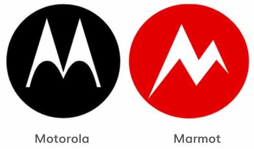 There is a fine line between creativity and imitation—this is something logo designers and brand owners really need to understand. Every logo design created till date is somehow an inspiration taken from the successful logos. Getting inspiration from iconic logo designs is not a bad idea, however, going overboard with imitations is something which is frowned upon.
There is nothing wrong in taking inspiration for your logo, nevertheless, it should not have an uncanny resemblance with globally known logos. Overmuch replication turns your company logo into a derivative design that has nothing special or unique to offer to its audience.
Logo designers naturally look up to the work of their role models or competitors to get an idea of what works for them and what doesn’t. However, the inspiration goes beyond the limit and ends up in plagiarism when designers go carried away with the replications.
Bear the fact in mind, plagiarism in design will make your company come across as a copycat. As a result, your customers will assume that your company lacks creativity and has nothing unique to offer to the audience.
Things to Avoid
- Being heavily inspired by other’s work
- Not researching what works better for your industry
3. Logo is Overly Trendy
There is a thing about trends and fashions; they make things attractive but for a small period of time. There is no dearth of design trends- almost every couple of months you get to see someone launching a new logo heavily inspired by the freshly introduced trends. We understand it gets difficult sometimes to resist the temptation of designing a trendy logo—that looks stunning too—but only for a certain period of time.
A logo design is supposed to be a timeless and memorable piece of branding that has the ability to serve as your brand’s identity for years and years to come. An overly trendy logo cannot serve as your ultimate identity, as after a few months or years, it will start looking dated.
Eventually, you will have to make some tweaks or get it completely redesigned. Therefore it’s better to steer clear of the design attributes that are too flashy and too fashionable.
Things to Avoid
- Going overboard with fleeting trends
- Including elements which fail to speak volume for the company
4. Logo has Multiple Messages
 As we have discussed above—successful design is not supposed to be filled with intricate details. Overstuffing of multiple elements in your design confuses your audience. Not only this, but the audience pays less attention to a design which incorporates too many scattered features.
Just like your mission statement, your design is the visual representation of your company. It gives an idea to your customers what your company has to offer.
The visual elements such as shapes, color and typography of your logo must be powerful enough to convey your brand message clearly and concisely. If you need to embed a couple of taglines in your logo to explain your message, that means it fails to serve its core purpose.
Be careful with your design choices, do not overstuff it with taglines or other typography. Instead, create a proportionate and legible design that says a lot with fewer details.
Things to Avoid
- Including more than one taglines
- Using too many colors or fonts
5. Logo Does Not Define Your Brand
No matter how excellent your logo is, if it fails to define your brand identity, it will fail to serve as your one of the most essential branding assets. To avoid a futile design, it is crucial to speak with your client before starting off with the design process.
You need to have a better understanding of the target audience and the message and purpose of the company the logo is supposed to represent. Otherwise, you won’t be able to put the logo design in the right context.
The core purpose of a logo is to make your identity visible in the sea of the same. Your logo should be more than just an image- if it is way too generic, it would not be able to stand out from the crowd. If your logo fails to serve its prime objective, then what’s the point of spending a hefty amount in your company logo?
Shortcomings
- Not considering your target audience
- Not understanding the brand’s standing
Key Takeaways
Designing a good logo may seem easy, but in reality, it’s quite a complicated task. It takes time, money, and skills to design a logo that defines your brand and leaves a lasting impression on the mind of your target audience. Keeping its significance in mind, you cannot afford going wrong with your design choices. If your company logo fails, odds are high, your business will too fail.
Avoiding these mistakes will go a long way to help you come up with a design which is striking, timeless, memorable, and most importantly, free from all mistakes.
Loius Martin is a Creative Marketing Manager at Invictus Studio, a custom logo design company in Southlake, Texas, also writes for sustainable clothing brands. Loius approaches digital marketing as not just a profession but a creative thinking process. He has a passion for writing about design, content, and social media marketing. Read more of his articles @loiusmartin1.
Creating a design stock photo by REDPIXEL.PL/Shutterstock


